Sound and vision: the artwork of Nervous Twitch
With their self-titled fourth album out now Erin Hyde of Leeds punk band Nervous Twitch talks Sarah Lay through their approach to artwork for their music.

“I always think the music comes first but I’d be lying if I said I didn’t think artwork was important! It’s a visual representation of your sound and should reflect your creative vision.”
Erin Hyde, one third of Leeds-based punk band Nervous Twitch has over the last 10 years paired her background in visual arts with the music the band are putting out. Designing their four album sleeves by hand she brings in the DIY ethos across the sound and vision, drawing on iconic imagery and styles from decades past and blending it into works which are often kitsch or quirky, but lovingly handmade and nearing iconic.
“I’ve always been a creative person, as a teenager I made my variety of bootleg band t-shirts, and would get requests from friends at college for some obscure band they adored. I would find old clothes in charity shops, sew bits of broken zips together, bleach out areas and stitch images and logos. Thinking of it I was asked a few times by independent shops to make items, and even a textiles teacher claimed my t-shirts were really Vivienne Westwood originals – maybe I missed an opportunity there!
“I naturally excelled in practical creative subjects and went on to study a degree in Fine Art. I found myself making music after I graduated, and although I’ll always be drawn to making physical art, I love the collaborative aspect to creating music. And a lot of the process is much the same, trial and error, playing about with different things, and running with an idea.”
Often using a simple black and white palette Hyde’s artwork is very much part of the band’s creative process with music and visual elements informing each other, although she admits music takes the lead on direction. She said, “Sometimes the artwork is the first thing a listener sees so it should tell your story and ultimately reflect what you have put into your project. I guess it might be easy for me to translate between the two, but even if you are not the artist creating the visual artwork, you’ve got to believe in it, or have an emotional connection to it.”
While all four of the band’s albums have been released on vinyl their singles are often digital only. Their most recent singles – Keeping Faith In Something, Tongue Tied, and Alright Lads – all had individual artwork which played on the core cover and artistic direction of the album from which they came, as well as bringing in the band’s trademark quirkiness.

Hyde said, “If I’m truly honest, I don’t think I put as much into digital release artwork, when I probably should. Possibly as I’m a keen record collector. Although I do listen to music online the experience is different. I’m usually working, or out running, however, when I have a record or a CD on, I’m fully engrossed in the audio experience and take time to appreciate the packaging.
“But for our latest three singles, I wanted to create something clean, simple, bold, and rememberable. People will see it from a wide variety of different screens, I wanted it to stand out even if it was only a tiny square on a Spotify android app. I also created a tryptic, for all the people out there who like me have a nerdy keen eye for visual arts and get excited about stuff like that!”
Hyde’s attention to detail is in every piece she makes. With a handicraft element to materials and process the artworks tend toward what is at hand, making them feel at once accessible and some what magical in their transformation of things others may not take a second glance at. Although the artworks have evolved the visual identity of the band this approach has changed little in the decade they’ve been making music together.
Hyde said, “The very first ever EP we released was created from an old collage piece I made, I cut it up and rather crudely scribbled together some text, photocopied it a load of times to give it a grainy, high contrast look. I love the naivety of it, even though it is a bit rubbish, but it has a great handmade quality. Photocopiers are – or were because they’re hard to come across these days – one of my favourite tools for creating art.”
The identity isn’t only contained to release artwork but feeds through into their merch designs too. It’s something Hyde thinks about a lot when they come to making up merch and takes inspiration from some perhaps unlikely places.
She said, “If I’m making a t-shirt, I want to create something that is someone’s fave go-to band t-shirt. I don’t know if I have ever achieved this? I personally love to wear our lucky cat design t-shirt a lot! Given an endless budget, our designs would possibly differ, but we like to work within our means and create something fun and affordable, so it’s accessible to everyone.
“As a band, we went through this phase of discussing how ’80s metal bands all had mascots – Iron Maiden had Eddie etc – but I’m not sure how a zombie rocker mascot would translate to our music. I guess that’s where the lucky cat came from, and the finger monster. They’re just fun retro icons that I feel our demographic can relate to.”
 As well as ’80s metal mascots the band’s visual identity, and Hyde’s own inspiration spans the underground and cult iconography of many decades. Asked to pick her own favourite artwork from another band she is spoilt for choice. She said, “That’s a hard question – I could literally pick millions! One cover that immediately comes to mind is The Mummies – Death By Unga Bunga. The monochromic colour palate is really striking, and placement of every element on the cover gives it such a dynamic feel, it has so much energy; which is very reflective of their music.
“The Cramps have fantastic retro kitschy covers that have a humorous b-movie edge to them. They incorporate vibrant colours, gold leaf, and even anaglyph 3D effect! Talk about adding another dimension to your music!
“The Buzzcocks have an excellent back catalogue of record covers, Malcom Garrett is a great artist. The simplicity of the forms and shapes mixed with bold colours and infographic imagery is very much reflected in their repetitive simple guitar solos, and their almost cartoon rawness.”
Bringing together those influences with her own work as an artist Hyde is committed to the human element in art, organic creativity, and being unafraid of originality. With social media encouraging paralysis or constriction by comparison Hyde encourages all bands – no matter how skilled they feel they are with the visual side of making and releasing music – to be true to themselves.
“Do something original to you. Making digital artwork is so accessible these days with modern technology so anyone can do it.
“I feel there is a tendency for some groups to try too hard, and sometimes slick art can look naff. Just like with your music, people want to see the real you, so don’t be afraid of creating something different or not getting it right. In a world where everyone is competing for a voice on social media, I think it’s best to stick to your own originality, rather than conforming to an aesthetic that is replicated by the masses.
“I guess I’m a punk at heart and like to see artwork – or social media accounts – that look like they have been made with heart, by the artist, by a real person, not by someone who is trying to sell a brand. I think that’s how people will connect with you, and your visual identity will come from that.”


Nervous Twitch artwork by release
Get Back In Line
The band’s debut album was released in 2015 on cassette through Odd Box Records, got a vinyl re-release through Middle Ear Recordings, and then got a re-issue to digital platforms through Reckless Yes in 2020. Using a limited palette heavily tilted toward the monochromatic black and white which would be revisited in later artworks.
“Get Back in Line was effortless! Possibly as I was involved in making the music, I don’t know, but it just came straight out in one. Jay (Churchley) thought it’d work to have a photograph of people queuing, so I just ran with that.
“I tried to contrast the rigidness of the phrase ‘get back in line’ by jumbling up the letters in and almost cramming them into the space, giving the feeling that they were also queuing up.”
Don’t Take My TV
The band’s second album, Don’t Take My TV, followed quickly on from their first with Don’t Take My TV released on vinyl in 2016 by Odd Box Records, and with a digital reissue in 2020 via Reckless Yes.
“With the second album arriving soon after the first they almost felt like they were the same project. I definitely wanted to keep a visual narrative running.
“I am a massive hoarder of kitschy collectables and the items are all things I have hanging around my house. I guess I must have picked up the tiny TVs first given the album name. The TVs are actually souvenir viewfinders that have little holiday scenes of Köln (I think!). I love the cartoonish look of the other items used and how they bring a fun bold element to the design.”
I Won’t Hide
The band’s third album, I Won’t Hide, landed a year later with a vinyl release in 2017 once again through Odd Box Records, and with a follow up digital reissue through Reckless Yes in 2020. The cover art moved away from the black and white narrative and kicked back against the social media-driven monotony of much artwork around at the time
“Around the time of its creation, I felt I was starting to see a lot of the same artwork popping up on Instagram, digital, flat, predictable, and too clean and perfect. I was drawn to the textures created in prints and paintings, and almost as a protest against digital art, I knew I wanted to create something completely by hand.
“The original artwork is a series of layered hand-cut Linocut prints. I played around with the opacity of the inks and papers building on top of a printed Chine Colle base layer. Some of the base print blocks were recycled and I cut unto them forming new interesting patterns. Inspired by the typography style of traditional sign painting a pieced together the text. The top layer needed to shout out the phrase ‘I Won’t Hide’.
“I made about 30 prints in the end, and used similar themes for our 7″ single That Weird Guy/Look at You Now. I sold a few online, and have one or two left. Unfortunately, some of our merch was stolen including the original 7″ single print, which broke my heart considering how many hours I poured into this artwork.”
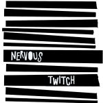
Nervous Twitch
After the band’s longest gap between releases yet, and signed to new label Reckless Yes, the self-titled fourth album was released on vinyl, CD and digital in 2021. The artwork returned to the black and white monochrome palette of their early releases, with inspiration coming from ’70s punk culture and leaned in to the idea of imperfection being perfection.
“I knew I wanted to make something by hand again, but I didn’t quite have as much time as I did with the third album, I ended up doing a blend of hand made and digitally produced. I started by tearing up shapes of paper and piecing them together to create a variety of compositions. I made hundreds of different ideas, some with splashes of colour, some with images from a pile of old 1950’s magazines I have. I was inspired by the artwork of Jamie Reid, Television Personalities album covers, and ’70’s punk gig posters.
“However crazy I went with the design I was always drawn back to the simplicity of the shapes on the paper and the starkness of the black and white. Intentionally I cut the letters by hand leaving a rough finish; sometimes things have a more interesting aesthetic when they don’t look perfect. There’s too much of that in the world, I feel that in some ways art (or other creative pursuits) are losing a human touch, and that’s kinda sad. Possibly that’s why art (and music) is almost becoming considered throw away… anyway that’s a whole other debate! I wanted to reference our first two albums with the lettering for our band name.”
Find Nervous Twitch: Twitter | Facebook | Instagram | Spotify | Bandcamp
Read our review of the latest – and self-titled – album from the band, plus singles Keeping Faith In Something and Alright Lads.
~
If you have enjoyed reading this piece on Popoptica you can buy us a virtual coffee via Ko-fi – every donation helps us to do what we do. We’d love it if you shared on social media too – and do join the conversation with us on Twitter and Facebook.
Find out what other new music has been exciting us recently and get in touch if you want to submit music or contribute to Popoptica.
Disclosure: Sarah Lay is editor of Popoptica and co-founder of Reckless Yes, so has some involvement in the release of this record – but she really does only write about or work on music she loves.
Sarah Lay
A long-standing music journalist she's also co-founder of independent record label Reckless Yes, an author of novels, and when not messing around with words and music, a digital strategist.
Latest posts by Sarah Lay (see all)
- Railcard – Two Steps At A Time (Skep Wax / Slumberland) - 22nd July 2026
- The Empty Page – A Feminine Ending (Kycker) - 18th March 2026
- th’sheridans – Painted (self released) - 12th March 2026